Showing posts with label practical. Show all posts

Monday, 27 April 2015

Lighting Practice


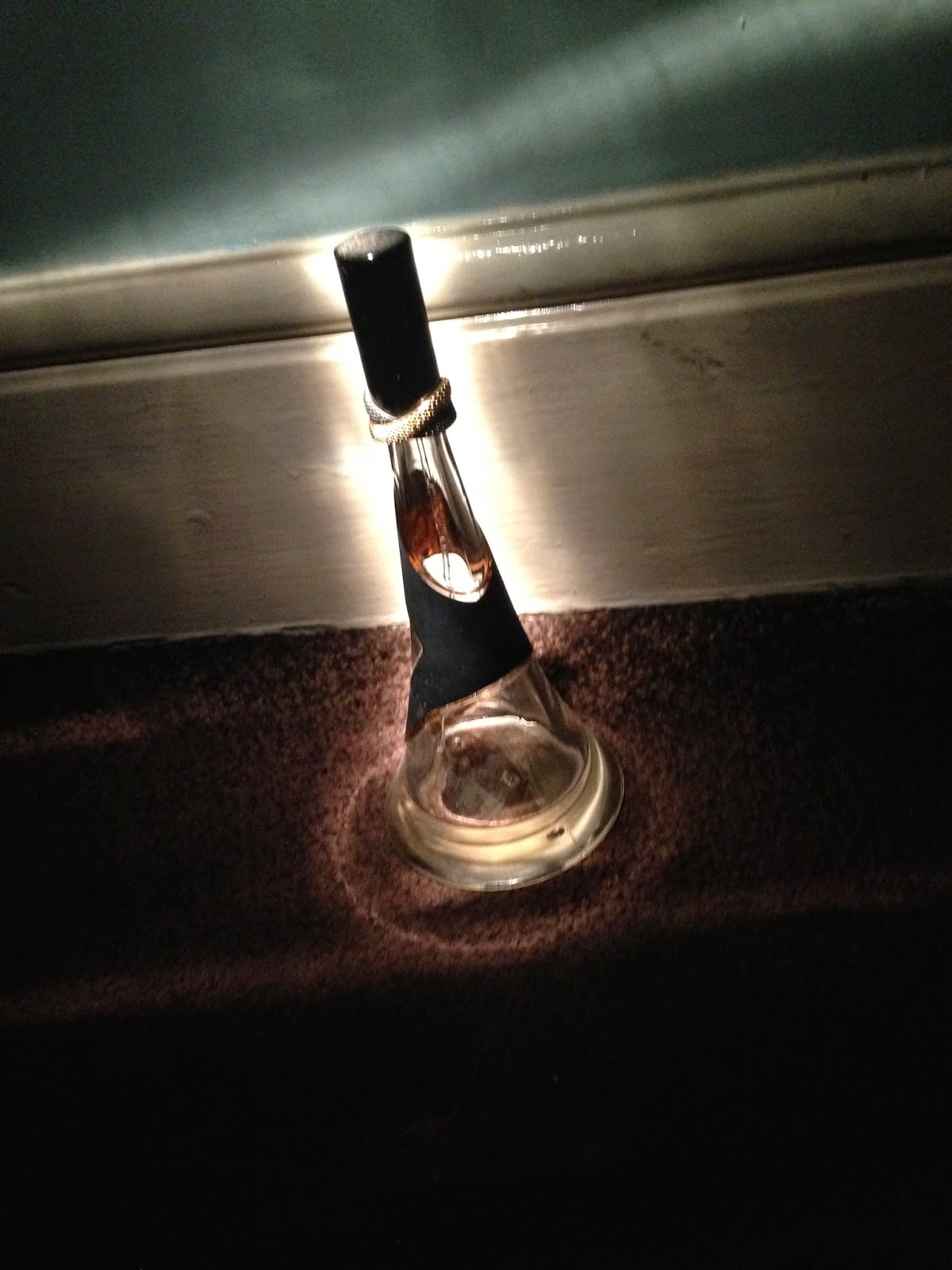
I wanted to practice different ways of creating light and the effect that they had when thinking about how to show the killers mask. Although the appearance of the mask is known and recognisable to the audience, as are many within the slasher genre, for example the 'Scream' mask, it is still important to keep some mystery within the trailer. The fear of the unknown within horror is what is so effective for the audience.
I used four different light sources which were a lighter, match, flashlight and red flashlight to evaluate the effect of colour lighting also. I had the basement scene in mind, in which one of the teenage characters creates light through one of these methods and the outline of the killer can be seen behind her, disturbing the audience.

Red Flashlight: I feel that the use of a coloured flashlight such as this is not appropriate for the type of 'natural' light we wanted to create, making it seem unrealistic. I feel that it is not really appropriate for our chosen slasher genre, and would more likely suit a sci-fi genre trailer. Having said this, it could be used for the poster image or an image to be featured on the website as the shade of red that it creates would give a strong link to violence and gore, therefore to our slasher genre.

Normal Flash Light: This provided a strong light source, giving off a lot of light. This is not ideal, as we want to keep some of the killer covered with low key lighting. This could be done however by shining the light on one side, as shown below right, instead of straight on (below left) or held above (top) as it still leaves one side unlit. The various positioning of the flash light also creates good shadows and although this cannot be used for the basement scene as it will be too dark, we can look at perhaps incorporating the creation of shadows into another scene.


Match: The match provided decent light, enough to see the shape clearly but still keep a fair bit of the detail hidden, which was what we were aiming for. The problem was that it was hard to do without the match burning out too quickly, meaning that it may be difficult to film a scene using this as a light source as it will fade out too quickly.


Lighter: At first it seemed that the lighter did not give off nearly as much light as we needed (right.) Yet interestingly, when the match was held close to the object, it provided enough light for the object to be seen and identifiable without showing too much detail. This may be the best light choice if we find a way for the lighter to be seen on camera without looking out of place e.g teenage character using a lighter to find her way, as the lighter must be very close to the object in order for it to be effective at all.

Making A Mask - Part Two

After being inspired by the 'sack mask' and 'The Scarecrow' in "The Batman", I was finally ready to make my mask. Below, is a step by step process of how I made my mask. 
I first placed the sac over my cousin. This was so that I could correctly plan where the features of my mask would go.
 
I then drew an outline for the eyehole on the sac.


Then, I cut an eyehole in the mask.

Afterwards, I made stiches near the eyehole. I also drew the lining of the mouth which was an idea from 'The Sac Man' in "The Strangers".


I then made some adjustments behind, so the sac would fit as a mask around the person wearing it. This was achieved through stiches.
As the sac was too long, I had to trim its length with scissors. The finishing touch was the rope around the neck area. Overall, the task did take long. However, it was easy to find my materials. The only thing left for me to do, was adding the dirt to the mask to give it a more rough look.

Thursday, 23 April 2015

Typography Manipulation

Now that we had the font for our film name, I had to come up with ideas to make our film name look more creative. One idea was changing the colour of our font. 

I opened up a new file on Photoshop.

I then used the default Photoshop size.

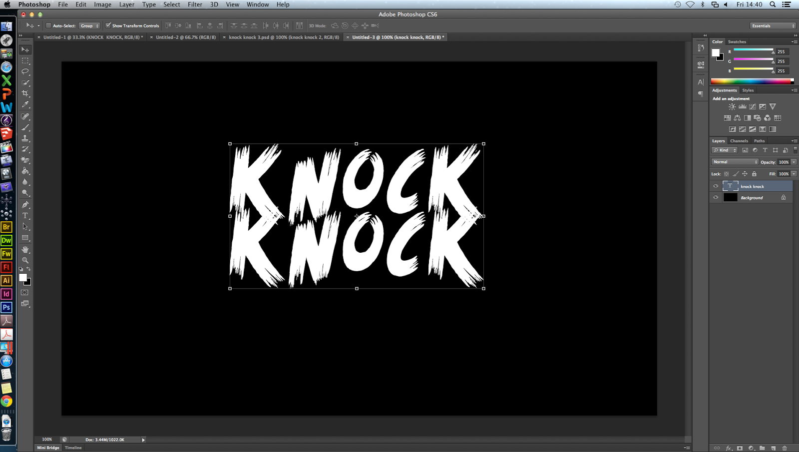
I went onto texts and selected the font 'Scream Again' which I downloaded from 'Dafont'. 

In my new layer, I kept the 'mode' as normal and the 'opacity' as 100%.  I named the layer as 'Knock Knock'. 

This was the font style of 'Scream Again'. 

I then went onto 'color' and then adjusted the intensity of the red colour to 244.


After adjusting the final settings on 'color picker', I then selected the letters in the film title which I wanted red. The red colour visually signifies blood and is therefore conventional of the slasher genre

Thursday, 19 March 2015

Designing the Website

For our website, we used the online builder, wix.com, to make a professional looking film website. We also had to look at inspiration from other existing, real, websites to see what kind of conventional elements we should include but also what twist each website had. One example is the one below, the Texas Chainsaw 3D website. It was highly interactive, when you put your mouse over certain parts they'd move, there was audio from the film, little jumpy sequences playing. It also had standard features such as links to other pages, the trailer, and reviews.


After taking some inspiration from existing websites, we decided to start our own. I thought it would be a good idea to actually design a lot of it on Photoshop and then upload it as a background image on to wix. 

I started with a grainy grey image I found on google, and layered onto it a mask of this black frame which added to the horror feel of the image. I then added blood splats in the corner and center, as well as a drip of blood in the corner. We wanted the blood splat to be in the corner of the embedded video on the website, to make it look like blood was splatting out of it, acting as a kind of border. This was simple enough as it encompassed skills learned from the poster creation a few weeks before. In fact, some of the blood stains are actually the ones used on the poster.

Following this, I added the titles in the exact same way we had them in the poster, white lettering, 'Scream Again' font, blood splats and the 'darken' effect. We used the same font from the trailer for the rest of the typography on the image, e.g. the tag line, the reviews. We arranged the texts in places to leave space for the embedded trailer and the links etc that would be implemented using HTML.
We then realised that our layout was not quite right and so went back and moved the text around in order to come up with this layout: 


On the website builder, we added the media links in the bottom right and a black background to the rest of the screen, which blended with the black border of the image. Next was to use some HTML code to create a marquee effect text box, to display fan tweets and create the links for the other pages. To do this I had to learn some basic code:

The most complicated part of the code I had to do was for the links. Basic HTML wouldn't work the way I wanted it to, so I had to use CSS or cascading style sheets.

<!DOCTYPE html>
<html>
<head>
<style>

p {
    font-family: "Big caslon", Times, serif;
}

a:link {
    text-decoration: none;
}

a:visited {
    text-decoration: none;
}

a:hover {
    text-decoration: underline;
}

a:active {
    text-decoration: underline;
}

/* unvisited link */
a:link {
    color: #FFffff;
}

/* visited link */
a:visited {
    color: #ffffff;
}

/* mouse over link */
a:hover {
    color: #fF0000;
}

/* selected link */
a:active {
    color: #ff0000;
}
</style>
</head>
<body>

<p><b><a href="default.asp" target="_blank">HOME</a>
<a href="default.asp" target="_blank">ABOUT</a>
<a href="default.asp" target="_blank">GALLERY</a>
<a href="default.asp" target="_blank">EXPERIENCE</a>
<a href="default.asp" target="_blank">CAST</a>

</b></p>

I could use this code to, firstly, make click through links but also change the font to 'Big caslon', the font we were using throughout our coursework and also make the hover colour red, as seen in this image:

We also used a feature on the website to add an audio button, like in the Texas Chainsaw website. We felt this was a nice touch and added some professionalism to our website. 

Tuesday, 27 January 2015

Editing Titles

For our titles, we wanted to use a font that appeared to be scratched into wood, as if it were scratched into the door, as our whole film has the theme of 'knock knock' and the door. To do this, we decided on the font 'Scream again' which we downloaded from dafont.com

We had a sequence of the killer slowly turning his head to the camera, and we thought we could use this with the title, to create an eerie clear reveal of the killers mask in full.

We also decided to manipulate the font, in order to give the titles an interesting twist. We used the effect 'bad tv', and turned the 'amount' up to full, to make the words 'roll' and stutter, for only a split second. The typography interrupted the images, to distort his face.

In this image, the distortion of the text can be clearly seen, as it rolls up the screen as if there was some kind of technological glitch.


We also used this for our typography throughout our opening. The 3 purple clips seen show the different effects. The first is the plain text 'WHO'S THERE?', the second it is moved slightly with the effect 'Bad tv', and the third 'flashing' to give it a burn out kind of effect, as if an old style projector was burning out:

Photoshop Practise - Text manipulation


I decided that I wanted to practise some photoshop skills before we made our poster, so that it could be as best as possible. I thought a good place to start would be by manipulating the titles to make them more effective. I started with the simple 'KNOCK KNOCK' font 'scream again' from dafont.com, on a black background.
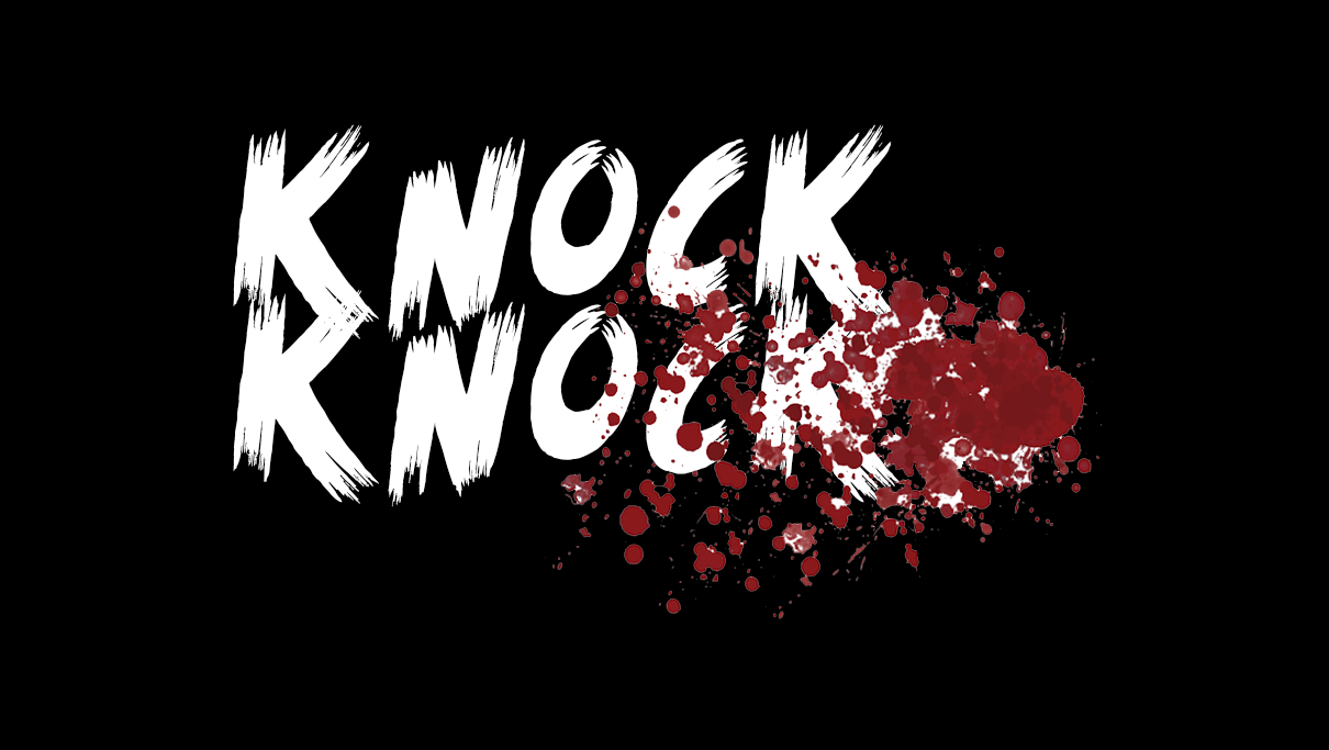
One effect I've seen which is quite effective is using blood splatters in the text. I found this one on google by typing in 'blood splatter' and saved it to my desktop. I then dragged it onto the image. It had a white background on it so I had to find out how to remove the background.


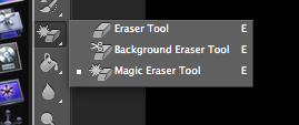
Using the eraser tool > magic eraser tool, I removed the background of the blood splatter and positioned it where I wanted.


Then I needed to back the blood splatter blend into the text, so I found out how to do this. I used the panel on the right hand side and selected 'darken' to make the blood fit inside the text, to make it look cleaner and more professional. 

After this, I added another blood splatter effect that looks more like a smear, to add some more dimension. I also added another copy of the text but moved it slightly and made it a crimson red colour, to look like a shadow, and make the text more '3d'. 


This is the finished product. If i re-did this, I'd try and make the letters move a bit more out of a straight line, but I could not work out how to do it at the time. I think that this could be used on our poster, but with different colours, depending on the background. 

For this, I took initial inspiration from this YouTube video, which didn't actually explain how they did it:

Friday, 24 October 2014

Possible Fonts For Film Title On Poster

After researching on existing film titles, I tried making a film title which could potentially be used in our poster.
 
From my previous research in As Media Studies, I know that film titles in slashers are short and sharp e.g. two words. This technique effectively allows the audience to immediately identify and remember the film name. For this reason, after coming up with my own film names, I decided to use 'Knock Knock'. The name relates to our plot of a unknown killer knocking on the door of the house the teenagers are in. People are familiar with the phrase 'knock knock' and so this film title would be incredibly effective in establishing our film's name.

I used 'Dafont', a website specially designed for font types.

After clicking on the 'horror' category, I found this font type called 'Scream Again'. I thought the font stands out, capitalisation is used in the font type. The overall look of the font matches the idea of a knock on the door, as the font can visually signify wood.

I then typed in 'knock kock' in the 'custom preview' tool bar. I selected large for 'size'.


Final product of film title.

In terms of colour, the black could work, or brown could be useful in connoting a wooden door. Applying red blood dripping to certain areas in the film title would work well with brown, as the colours contrast quite well. Black however would also be appropriate. Deciding on colours however will all depend on our mise en scene in the poster, in terms of our background colours. This font can also be used in our teaser trailer. The colours again will heavily depend on the mise en scene in the point at which the film title is displayed (towards the end). 


Tuesday, 21 October 2014

Outside Location Ideas

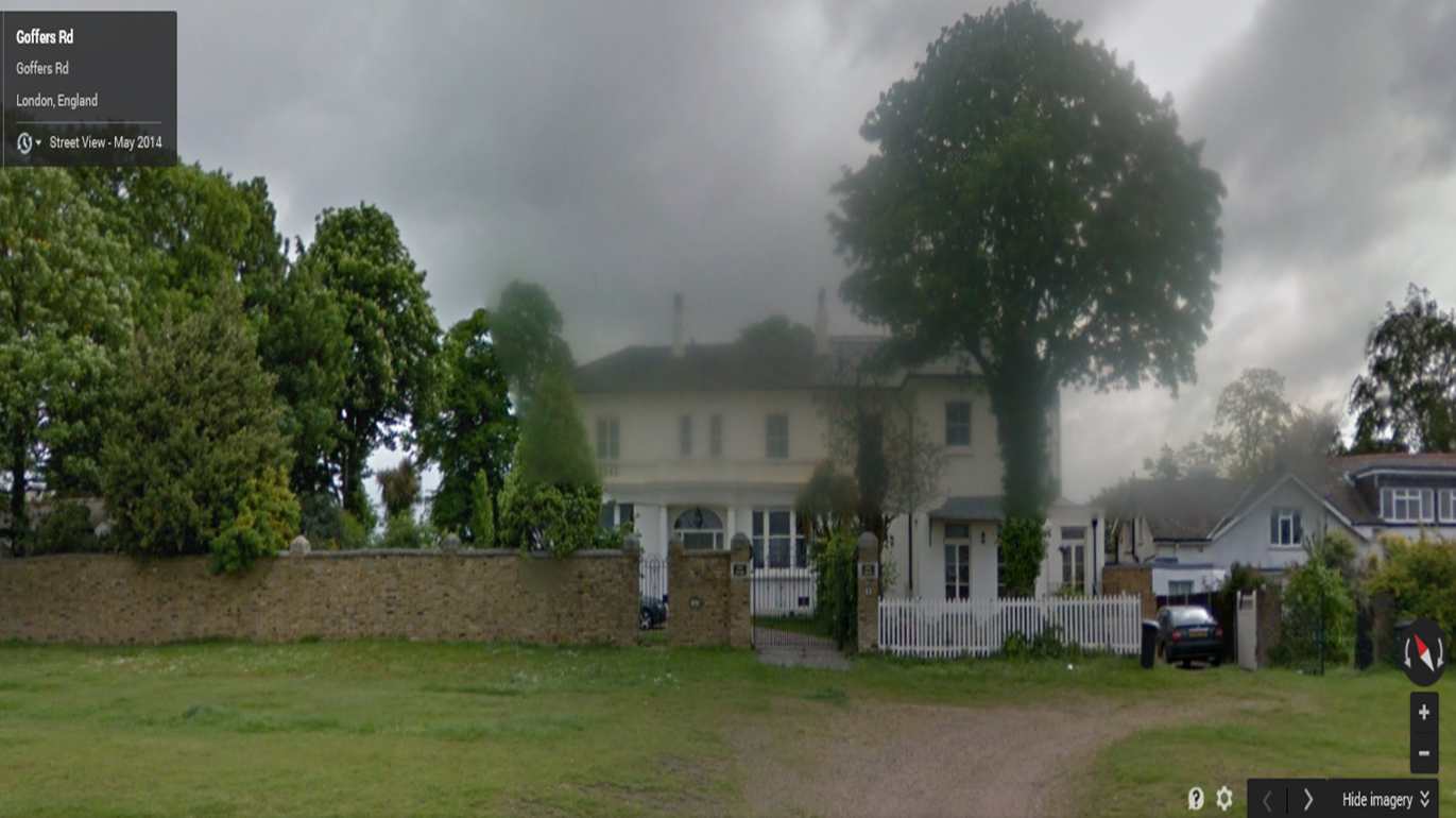
My group and I will be using two houses for our mise en scene, one for our inside location and one for our outside location. From my deconstructions into slasher teaser trailers, I have found the houses will be detached, fairly big and sometimes eerie looking. However, as an eerie looking house will not being suitable for our narrative, we will be using a regular house for our outside location. Below are examples of possible houses we could use from the outside.
This house is located in Kidbrooke. It's medium sized, detached. The long driveway can be ideal for the escape path for our main girl.
This is also located in Kidbrooke, detached, more modernised. The extended driveway can also be another footpath for the main girl's escape.

This house is larger, located in Blackheath, Griffin Road.


The first house in Kidbrooke will be our selected choice for our outside location. The outside look is very conventional of a house in a slasher film. We will use an establishing shot to denote the house at the beginning of our teaser trailer.