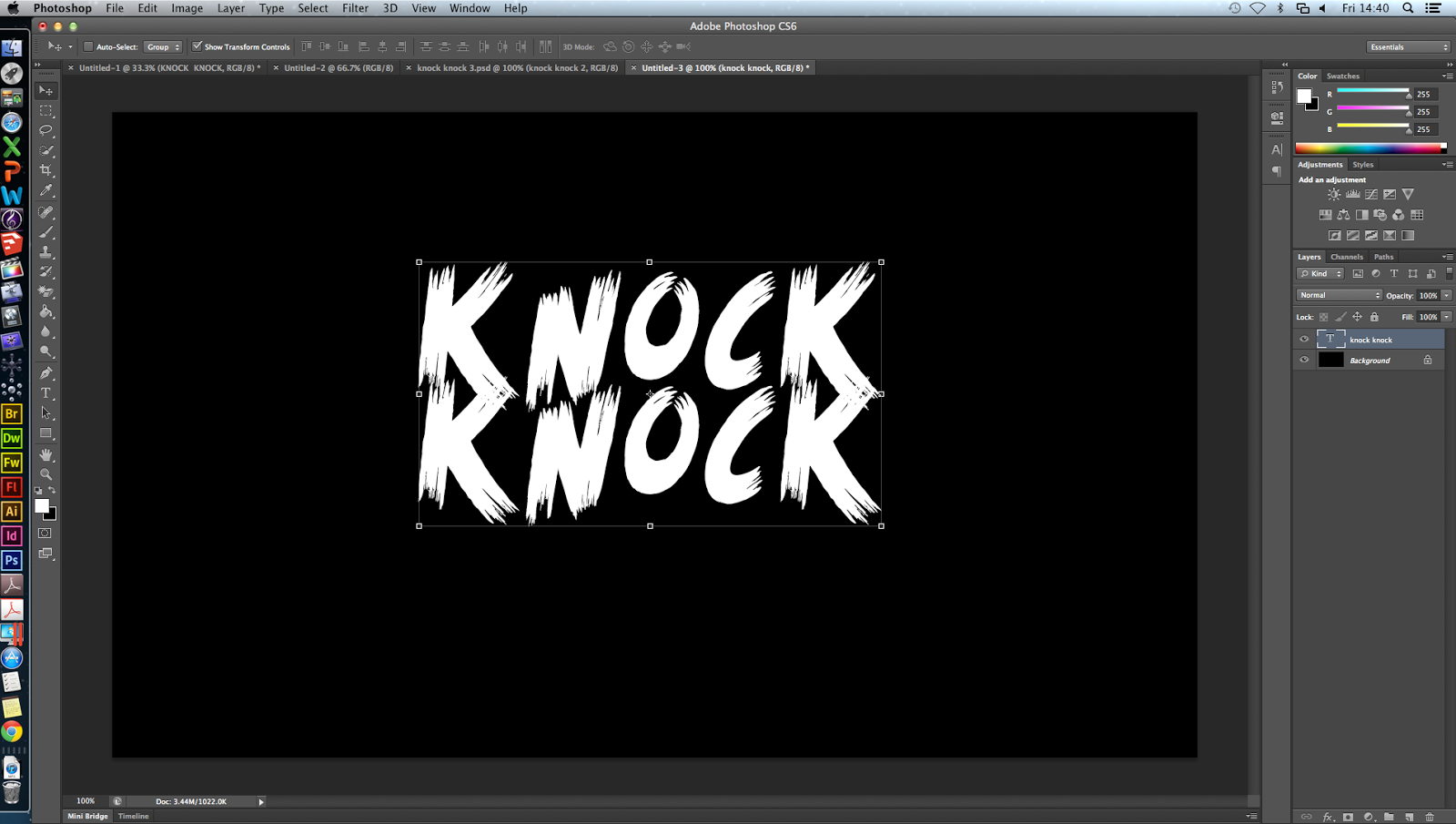
I decided that I wanted to practise some photoshop skills before we made our poster, so that it could be as best as possible. I thought a good place to start would be by manipulating the titles to make them more effective. I started with the simple 'KNOCK KNOCK' font 'scream again' from dafont.com, on a black background.
 One effect I've seen which is quite effective is using blood splatters in the text. I found this one on google by typing in 'blood splatter' and saved it to my desktop. I then dragged it onto the image. It had a white background on it so I had to find out how to remove the background.
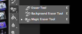
Using the eraser tool > magic eraser tool, I removed the background of the blood splatter and positioned it where I wanted.
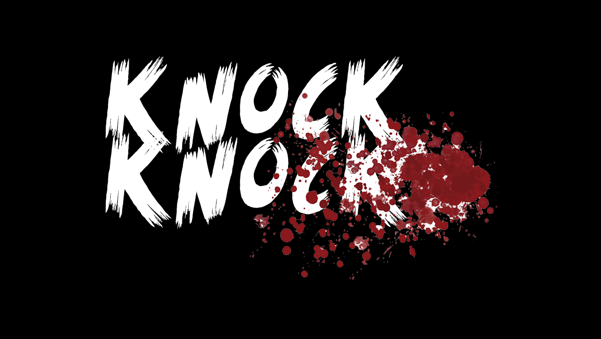

Then I needed to back the blood splatter blend into the text, so I found out how to do this. I used the panel on the right hand side and selected 'darken' to make the blood fit inside the text, to make it look cleaner and more professional.
After this, I added another blood splatter effect that looks more like a smear, to add some more dimension. I also added another copy of the text but moved it slightly and made it a crimson red colour, to look like a shadow, and make the text more '3d'.

This is the finished product. If i re-did this, I'd try and make the letters move a bit more out of a straight line, but I could not work out how to do it at the time. I think that this could be used on our poster, but with different colours, depending on the background.
For this, I took initial inspiration from this YouTube video, which didn't actually explain how they did it:
No comments:
Post a Comment