Showing posts with label deconstruction. Show all posts

Monday, 27 April 2015

Deconstruction of I Spit on Your Grave


-The trailer opens with the production companies alongside sinister non-diegetic sound, already creating tension.
-A tracking shot of the open road allows the audience to see that the location will be forest area. This is typical of the slasher genre as it is secluded and allows many places for the killer to 'hide' or appear from.
-The close up of the girl, gives the first introduction to the main character who is at first the victim before getting her revenge as the villain/hero.
-There is the on-screen diegetic sound of a harmonica as a mid-shot introduces us to male characters. 'Yeah you're lost alright' followed by sinister laugh as the shot pans to the girls face followed by a non-diegetic boom makes the mood uneasy for the audience.
-The point of view shot of her in the home before an over the shoulder shot of the camera used to capture this allows the audience to understand that someone is watching her without her knowledge.
-There is a non-diegetic bang as the scene straight cut to text. The text is a white background with red writing, the black marks and blood splatters make it look distressed and this links to the violence and distress of the slasher/horror genre.
-As the sinister non-diegetic music builds, creating tension, a panning shot of the female characters worried face before a loud knock on door and straight cut to man knocking is alarming the audience.
-Close up shot of girl visibly distressed is upsetting to the audience. An extreme close up of her surrounded by the men makes her look vulnerable and provokes audience sympathy for her.
-Fast paced straight cuts show audience that she is abused by the men, providing them with a reasoning for her later actions.
-A long shot straight cuts to a close up of the girl looking visibly changed and scary which is unnerving for the audience, accompanied by a low pitch sound.
-Straight cuts become fast paced and begin to build, showing glimpses of what she does to get her revenge against the men. There is a repeated sound every time it cuts to the next clip, accompanied by diegetic sound.
-The film title appears in the same distressed style as previous text had been, followed by the credits.

Deconstruction of Scream 4 Trailer


-Opens with the production company, overlapped with the non diegetic sound of a phone ringing, a main feature of the past scream films as the killer first communicates through a phone call.
-A female character (Sidney from the previous films) answers the phone during a pitch black transition. The killers voice on the phone is instantly recognisable.
-There is a non-diegetic sinister boom and straight cut to a close up shot of the female character looking distressed.
-There is a non-diegetic narrative from the killer as mid shots of characters flash up to low pitch boom that begins building up, starting to create tension for the audience which is the key component of the horror genre.
-The non-diegetic sound of the killers evil laugh is un-nerving for the audience, followed by a diegetic scream within a mid-shot of two characters before the screen fades to black and text appears.
-The instantly recognisable scream mask is shown. There is already the familiarity with him as the teaser trailer introduces other main characters to the audience. Most of these are teenagers, which is a character choice typical of the slasher genre.
-Both the use of a high school and suburb location is typical of the slasher genre.
-The sudden straight cut to a long shot of the first victim dying is shocking for the audience, but sets the tone for the slasher film.
-The line 'and virgins can die now' in which the characters are talking about slasher conventions within the film.
-There is a fast paced long shot of a girl trying to escape killer, another victim before more text appears. The text is black and white and red, which is typical of slasher genre as black and white can be dull yet sinister while red links to the violence and gore of the slasher genre.
-An over the shoulder shot gives the first glimpse of the killer in action with the instantly recognisable mask and weapon of choice.
-A close up shot of the character Gail links back to previous films.
-The fast paced straight cuts of the masked killer attacking his victims begins, accompanied by a non-diegetic narrative.
-The dramatic orchestral music begins to build to a climax, creating suspense for the audience before a blackout.
-The blackout fades into a mid shot of two blonde characters with no sound, before the sudden interruption of the scream killer coming towards screen, distressing the audience. The scream title appears in its classic typography, before a short phone call scene followed by the release date.


Existing Slasher Poster Deconstuction

-There is the central image of the killer wearing well known hockey mask with weapon of choice 
-Use of backlighting means you can't see the killer completely, adding some mystery
-Outline of the forest can be seen in foggy light, which is a classic slasher genre location, and well known for this film
-The film title is capitalised in red, connoting gore and therefore linking to the slasher genre, with sharp serifs giving it a gothic look which is typical of horror genre films 
-Red typography contrasts against dark background which is sinister, the date of release is in red too drawing attention to key information  
-The tag line is capitalised on its own at the top, making it draw attention whilst being easily readable
-The credits are small at the bottom with the production company logos as well as the rating certificate 
-The link to former well-known slasher film ' The Texas Chainsaw Massacre' is clear

-The killers face is in flames and is easily recognisable
-The flames provide light for outline of killer who is holding a mask and weapon of choice
-Victims can be seen within the face, which is distressing for the audience, fire generally signifies hell and death which links to the genre
-A suburb house can be seen under the flames, which is another classic slasher film location, playing on the idea of realism that is disturbing for the audience 
-The credits are small in yellow at bottom, whilst the release date is bold in red, drawing more attention
-Tagline is in white at the very top, drawing attentions as it is clear and capitalised
-The main colours are red, orange, black, white, all typical of the horror genre, slasher in particular 

-Clear link to famous director Wes Craven who made the original Scream movie
-As it is the fourth in the sequel, the number 4 replaces the 'a' in scream, with red colouring that links to the violence of the slasher genre whilst making it stand out against the black and white 
-Classic thick scream typography that was used for all the previous films, it is capitalised and spaced out with the 'm' being sharp and blade-like, connoting a weapon and linking to the slasher genre 
-The release date is in red, standing out against the black background and white credits at bottom
-Key image is the characters as opposed to the killer, however the famous scream mask reflection can be seen in the knife which is tinted red connoting blood and linking to the gore of the slasher genre 
-The tag line is in red at the top, but is not capitalised 
-The main colours are black, grey, white and red which are typical of the horror genre 
-Past generation of characters can be seen in black and white above younger characters e.g courtney cox who has played Gail since first scream movie

-All black and white apart from the blue of the eyes, with the hand covering her mouth representing shock and distress
-There is no key image of killer or any features of them such as the mask or weapon of choice, however is does feature the final girl Sidney, who is the main character 
-There is again the thick and spaced out typography with the sharp blade-like 'm,' giving the idea of a weapon and linking to the slasher genre 
-The tag line at the top is long and not capitalised, however still readable and attention grabbing as it is away from the central image 
-Wes Cravens' name is clearly visible at the bottom
-The names of the actors are capitalised above the general credits at bottom of the poster 
-There is no clear release date as there is on other posters
-As this is the oldest film poster (1996) subverts a lot of conventions that the others have in common such as the feature of the killer on the front and a clear release date and short snappy tag line

-There is the central image of the masked killer with his weapon of choice, with the chainsaw linking to the title as well as being easily recognisable as this is a remake of the classic slasher film
-The credits are at the bottom above the larger and capitalised release date 
-The main colours are black, greys and red, typical of the slasher genre 
-The title is capitalised in a gothic font with sharp serifs, typical of horror genre films
-Colour of the title is distorted so it is not completely white, making it look old and worn, adding to the distressed feel 
-The tag line is not typically at the top, it is just under the title and although smaller, it is still capitalised and bigger than credits 
-The slight backlighting allows for some light to be shed on the killer allowing some of him to be seen, but still keeping a mysterious feel that is important for the killer to keep as the fear of the unknown is a key feature for the audience to find the film effective 

Thursday, 29 January 2015

Poster Deconstruction

You're Next
  • Tagline 'they will hunt you' - relates to the animal theme. use of 'will' highlights certainty - makes audience feel scared 
  • 4 star rating and comment, gives audience idea of how good the film is
  • 'August 29' - information important for audience
  • 3 dimly light figures, masks highlighted the most. weapons also seen - gives audience an insight into the killers
  • slight backlighting / under lighting to cast shadows on the masks, distorts them
  • main colouring is dark with yellow hints, from the lights
  • usual writing at bottom

Friday the 13th
  • 'Welcome to crystal lake' - tag line - relates to the narrative, many people will be familiar with it, due to the original film 
  • Main colours are black and blue, from the sky and the lake. Gives off an eerie connotations 
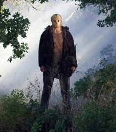
  • The figure itself is backlighted by the moon's light. This casts shadows and slighlt disfigures the mask - although we can still tell its Jason, as the infamous mask is lit up. The weapon is also visible.
  • Easily identifiable red typography
  • usual writing at bottom 
  • Focuses on the killer and sets it in the woods, giving the audience an idea of the narrative.


A Nightmare on Elm Street
  • In this poster, Freddy takes up the whole space, his burned face visible and his knife fingers visible - there is even a gleam of light to draw attention to it.
  • His infamous striped top and hat are also easily identifiable in this poster
  • They use the tag line 'Never sleep again' from the fairytale like song in the film - fits in with the narrative

The Texas Chainsaw Massacre
  • This poster is slightly more artistic, The title is at the top and an image is used within the text from the film, to give the audience an idea of the narrative
  • The main image is of the state of Texas, with blood dripping out of it, which could be easily done on photoshop. In the image, a famous picture of Leatherface wielding a chainsaw can be seen. This is identifiable to fans of the film
  • 'Who will survive and what will be left of them' - slightly humorous tag line, implying people will be sliced up 
  • usual writing at the bottom

For our poster, we want to get an image similar to the first, of the door with the killer behind it/perhaps looking through the window, and a victim in front, holding the door back? Looking scared? title at the bottom, tag line at the top, usual writings at the bottom, possibly a rating on the poster somewhere


Monday, 24 November 2014

Target Audience Research and Findings

Before we even started to plan our film opening in any detail, we had to decide on a target audience. As we decided to make a horror film, it was almost impossible to have the age rating as under 15 because horror films are almost always scarier and more intense than any other genre. As well as this, we looked at our sub-genre, slasher and took inspiration from their age rating certificates.

Some of the most popular slasher films and their age certificates:


  • The Texas Chainsaw Massacre 2003 - 18
  • A Nightmare on Elm Street 2010 - 18
  • You're Next - 18
  • I Spit On Your Grave - 18
  • Halloween - 18
  • Friday the 13th - 18
Clearly, a common age minimum is set at 18. This means the  target audience would range from 18-25, young adults/teens to mid twenties, as this is what seems most appropriate for our film genre. 

The age certificate which we have placed on this film is a 15. This is mainly because of the high level of violence in the film where there are strong brutal images in which we feel that it is not suitable for people who are below the age of 15. Also because the brutal images are not shown  for long periods of time we felt placing an 18 certificate on the film was not necessary. Furthermore, there is no sexual violence or upsetting themes of that type.

"The 18 certificate was created in 1982 as the successor of the previous X certificate, which in turn was the successor of the H certificate (with H standing for "horror"). Typical reasons for restricting films to the 18 certificate category have included scenes of hard drug use, supernatural horror, explicit sex, sadistic violence and sexual violence — the last two of which have in the past led to a certificate not being issued at all, effectively banning the film in the UK. It was only recently that the censors passed films with explicit ('hardcore') sexual acts despite the 18 certificate existing for many years."

So what kind of content can we show and what can we do to attract the target audience? 

  • If our age group is the maximum age limit, we are technically allowed to have gore, violence, sex, drug use, frightening scenes etc. However, this would not be appropriate for our film as it doesn't suit the narrative. As a 15 rating, there would still be some gore, but not shown for long periods of time. Furthermore, there would be no strong sexual scenes/violence. 
  • We will have no foul language in our teaser (as it has to be appropriate for everyone) but in the film, swearing could be used mildly. 
  • In our whole film, gore and violence would be acceptable, as this is clearly a common convention for our genre
  • For our film trailer, we would keep the gore and violence to a minimum, to keep the most intense scenes secret and to tempt the audience into coming to watch the whole thing.


Monday, 17 November 2014

Deconstruction of Teaser Trailers (editing)

I wanted to take a closer look at a couple of teaser trailers and how they are actually edited together i.e. the transitions used, type of sequence used, typography used, where the titles go etc.

I Spit On Your Grave


  • starts with production companies, followed by a dimly lit establishing shot of an old, wooden looking cabin
  • transitions are fade to black and black to picture again
  • short, 2-3 second long sequences are used in conjuction with non-diegetic creeking noises
  • dimly lit, ambient lighting used only - adds to realism of the sequence
  • tracking shots, and steadicam used.
  • edits of sudden black and white and tears appear across still images, like a ripped/folded photograph
  • the typography uses a simialr type of edit, with flashing/beaming light, as if a torch is going over it. 
  • fast paced edits of crying, turning around are used to build the tension
  • sudden flashes of colour, as if a shutter has been used over the image
  • the typography is used to set the narrative, in a slow building way
  • most of the fast paced horror sequences happen in the last third of the sequence, with no more fading transitions, only straight cut edits
  • the title is at the end in the same style as the typography throughout
  • one more gruesome image is shown, followed by 'coming soon'.
A Nightmare on Elm Street


  • starts with production companies
  • establishing shots, dimly lit, greeny/bluey hue throughout. desolate land. very eerie.
  • non-diegetic music starts the audiences fears. 
  • a chase scene starts and slow motion is used to really capture the actors fearful facial expressions and body language
  • the contrast of the firey-red petrol bomb and the bleak greeny-grey hue emphasises the importance of the fire.
  • slow motion sequences show the anguish on the actors face as he burns alive.
  • 'from producer' shows legitimacy and will give the audience high expectations
  • the font used is red on black, with a serif style
  • fade to black transitions, accompanied by a clicking noise
  • establishing/long shots used of freddy at first, to keep the mystery
  • yellow hue starting to be used
  • panning shot of 'elm street' referring to the film title and as this is a remake, reminding the audience of what they may already know
  • establishing shot of house, accompanied by creepy non-diegetic singing, '1,2 freddy's coming for you, 3, 4, better lock your door'
  • fast shuttering again, to build tension, make audience jump
  • slower sequences are mixed with 'jumpier' sections 
  • several long shots, showing the immense lighting and special effects used to create decrepit scenes
  • again last 20 seconds show the really fast paced moments, building to the girl being lifted from her bed. this shows the audience a lot of the action to get them scared
  • fade to black, show title
  • then last little scare - small scene of freddy talking, doesn't really do much but we finally see his burned face - the final reveal
  • tag line shown, then the date of the release.
You're next


  • starts with panning shot, seemingly normal, old, grand house used - shows definite wealth
  • ambient lighting. 'girl next door' type actor, brown hair, plain clothes
  • then sudden shattering of glass
  • slow motion, low angle shot of all weapons falling and girl falling - non-diegetic ringing music - implies panic
  • distorted slow motion view of people escaping, reflecting the moment of panic by the actor
  • low angle shot of masked perpetrator entering the home, axe visable, makes the killer seem bigger and powerful 
  • slow motion shows girl crawling away, particular interest in her very scared facial expression and body language. non-diegetic music gets faster, more panicked
  • close up of axe hitting the ground next to the 'final girl', music stops, straight cut to black
For ours
  • definitely use fades to black at the start, until final third, where all the action happens - use straight cuts
  • use non-diegetic building music and shuttering sounds 
  • use ambient lighting, play around with hues and effects 
  • keep title til end, then 'coming soon'
  • use fades to black for typography
  • use some kind of shuttering over the text also, and serif fonts.

Friday, 24 October 2014

Deconstruction On Film Titles

Part of our coursework entails making a poster for our film. I have carried out some research on the various font types used in slasher films. Below, I have deconstructed several film titles from the sub-genre
Friday The 13th (2009)
 
  • The letters have been capitalised
  • This makes the film title stand out, drawing the audience in. 
  • The colour of the font is red. 
  • Red visually signifies blood and death which relates to the slasher genre
You're Next
  • Capitalisation has been used.
  • The font is red, having connotations of blood, horror etc.
  • To convey the theme of blood and death, the film title has blood dripping down.
  • The audience relate to blood from the use of red.
The Strangers

  • The letters are not capitalised.
  • The colour of the title almost mirrors light.
  • The colour subverts conventional colours of a slasher film.
The Texas Chainsaw Massacre
  • Similarly to 'The Strangers' film title, the title is lit.
  • The effect of this can perhaps be to build a contrast between the title's light colour and the black background, which draws the attention of the audience.
  • The font's colour is white which complements the white 'scream' mask.
  • The white also contrasts with the pitch black background, making the film title stand out more.
  • Red has been used in the title, which can be a visual signification of blood.
  • Capitalisation has been used, making the title look prominent.
Generally, I have found that capitalisation tends to be used with the film title. This can allow the film title to stand out and therefore draw an audence in. The backbround's colour/theme will contrast heavily with the colour of the film title, also making the title look prominent. Using red in part of the film title is a conventional tool for signfying blood.
 
What we can do?
  • Capitalise our letters.
  • Use a colour for our film title which contrasts well with the background.
  • Apply some red, perhaps in the form of blood dripping.

Tuesday, 21 October 2014

Scream 4 Teaser Trailer Deconstruction

Below, I have deconstructed the teaser trailer for Scream 4. I will be particularly focusing my analysis on elements within the mise en scene which are conventional for a slasher film. 


Mise En Scene
  • The trailer firstly denotes the production company, 'Dimension Films'.
Cinematography
  • The medium close up shot effectively focuses the audiences' attention towards the production company, allowing 'Dimension Films' to establish their position.
Sound
  • The off-screen diegetic sound of the telephone ring sounds during the establishment of the production company. The sound raises an enigma, as the audience cannot see the telephone, which creates an eerie atmosphere at the beginning of the trailer. 
Mise En Scene
  • The audience can identify the main girl, through her innocent look. The trailer has included her in the opening scene of the trailer, suggesting she may be the central focus in the film.
Cinematography
  • The medium close up denotes the main girl's facial expressions. The audience can note she is in shock.
  • Fade in transition shots used are pitch black which are suspenseful, complementary of the sub-genre (slasher). 
Sound
  • The audience hear diegetic dialogue of "Welcome home Cindy" from an unknown caller.
  • Again an enigma is raised, as the audiences do not know who the caller is.
  • The audience however can identify that the caller is a man, through his voice.
  • Off-screen diegetic sounds of screams orally signify the film's title - Scream.
  • The sound also connotes that the unknown killer may not be pleasant. 
Mise En Scene
  • Two young girls scream. The audience can see that they frightened, suggesting the killer's presence being active.
Cinematography
  • Naturalistic lighting helps the audience to examine the characters' facial expressions. 
  • The two shot connotes the theme of the youth being close to each other throughout the events in a slasher. 
Sound
  • An off-screen diegetic sound of a man's scream is heard, which has a echoing effect. 
  • The sound can be an oral signifier of the killer's presence and eeriness. 
  • The girls' screams are on-screen diegetic which raise climax
                            
                            
Mise En Scene
  • The above shots denote the killer's presence behind the victims.
Cinematography
  • Editing has been applied in the first shot, with the killer being blurred. This technique effectively makes the shot more suspenseful. 


Mise En Scene
  • One of the girls appears to be running.
Cinematography
  • Panning is used to denote the girl's pace. 
Sound
  • Non-diegetic music is used which is upbeat. Drums sound throughout this point repetitively.
  • The sound effectively complements the action in the mise en scene.

Mise En Scene
  • The killer appears to be attacking a female character, during the events of the climax.
  • The killer misses his target and struggles to pull his knife out of the dresser table.
Cinematography
  • A tilt is used as the girl defends herself. The camera tilt creates effectively makes this part of the trailer more intense.
  • The tilt may also make the audience feel that they are experiencing the events (audience positioning).


Mise En Scene
  • The killer appears to be running towards his victims.
  • The killer is holding his knife, ready to attack his victims.
Cinematography
  • long shot denotes the killer.
  • The killer, as he runs, comes closer to the camera, denoting him in a medium close up shot.
  • The effect of the killer coming closer to the camera, is of the audience almost feeling that they are being enclosed in by the killer.
Sound
  • The sound is still upbeat, orally signifying fast pace and climax which is suitable for the movement in the scene.

Mise En Scene
  • The film's name appears at the end of the trailer, as a way of concluding the events.
  • 'The Scream' mask is in the background which portrays the film's theme/name.
Sound
  • An off-screen diegetic sound of a scream is used at the end, again to hold the themes of screaming, horror and fright.

Friday, 17 October 2014

Costume Ideas

Final Girl costume
  • Sidney (Scream)
  • She wears simple t-shirts and jeans, still looks very pretty, just not as 'done up' as her female counterpart. 
  • She wears basic/minimal makeup 
  • Our character could wear her hair down and curly, so it looks natural. 
  • Our actor could wear jeans and a t-shirt, maybe a baggy jumper, nothing provocative but also nothing that makes her look like she's from the 1800's.
  • She can wear basic makeup, no lipstick or harsh eye makeup, to look as natural as possible.
  • E.g.: 

Blonde Girl costume
  • Usually more provocative, perhaps shorts and a top, or something more low-cut
  • Blonde hair usually seen
  • E.g. blonde actress from Cabin In The Woods
  • Perhaps more makeup, not over the top though, only a pink shade (not red!)
  • Our actress can wear leggings and a crop top, to show of some midriff and skin
  • Nose piercing (our actress has one)
  • E.g.: 


The Boys
  • In TCITW all male actors wear a top, with an open checked or plain shirt over the top
  • This is quite American though, and we feel that it would be more appropriate to just wear a t-shirt instead, and it is more appropriate for our age group
  • Our actors can wear jeans and a plainish t-shirt
  • Perhaps more sports wear, e.g. trainers to make it more casual.
  • E.g.:


The Girls
  • 'Normal' clothing, e.g. jumpers, t-shirts, jeans, earrings, straight or curly hair, don't make them stand out but don't make them look too plain either.
  • e.g. these girls from 'Jennifer's Body'
  • Our actors could wear their own clothes that they'd wear on a casual day out e.g. skinny blue or black jeans, a t-shirt and jacket, boots or trainers.
  • e.g. 


The Killer

  • All black, usually, gloves often worn
  • Heavy boots, jacket and trousers
  • Sometimes suits are worn e.g. The Strangers
  • Mask - sack mask as seen in other blog posts
  • e.g. Michael Myers / Jason / The Strangers


Wednesday, 15 October 2014

Light/colours Deconstruction + Attempt


Horror film lighting effects
  • Green light is commonly used in horror films e.g. Saw
  • The use of green light creates a dirty, grimy effect, which reflects the mise en scene used in the film e.g. dirty settings, rusty weapons/traps and rotten flesh
  • Blue light is quite sterile looking and cold. It reminds me a lot of a surgical kind of film, perhaps like 'Pulse'. It adds a clean and precise feel to the look, could perhaps be used for a 'thriller' kind of film and would not be appropriate for a slasher film
  • Yellow is used in the film 'The Collector', it reminds me a lot of 'The Texas Chainsaw Massacre'. It could be used to reflect the kind of hot, desert environment e.g. Texas, and amplify the hostile conditions they live in.
  • I noticed also in films like 'A Nightmare on Elm Street', the use of a reddish light, reflecting the narrative (Freddy Krueger is burnt alive by the parents of the children, so red is for the flames). 


    My version, using a simple video clip:

Evaluation
  • I really like all the colours, however for our slasher blue will not be appropriate, as it is usually used in more sterile, hospital like films, perhaps The Human Centipede or something of that nature.
  • I like yellow also, but am unconvinced that it will suit our film as much as the red might.
  • I'm not sure if any of the colours should be used on our film, but it wouldn't hurt to play around with the tints when we come to edit.
  • Also, as my clip is just taken in a media lesson, it hardly helps establish the slasher or horror film. I might do this task again when we have some footage to play around with from our actual piece.