Tuesday 9 December 2014

Film Schedule

Date: Thursday 10th of December
Time: 4:30 pm
Location: Tor's house
People needed:

  • Holly - filming
  • Gaurav - killer
  • Lorna - main girl
  • Tor - actor (main girl's friend)
  • Fraser - actor (main girl's friend)
Equipment needed:
  • Camera
  • Tripod

Props needed:

  • Mask
  • Knife x2 (one for the killer, one for the main girl)
  • Alcohol bottles
  • Cigarettes
Shots to be filmed:
  • Re-film mirror scene
  • Close up shots from various angles of killer grabbing main girl
  • Re-film door shots

Thursday 4 December 2014

Evaluation of Filming - 24/11/14

Date: Monday 25th November
Time: Meet 4pm at Tor's house


We were supposed to film:
  • Opening sequences (party sequences), laughing joking, try to capture real laughter etc, to look realistic
  • All shots of the door
  • Basement shots
  • All final girl shots
  • All killer shots
  • Should all be filmed
We managed to film:
  • Party sequences
  • Several Killer shots
  • Several final girl shots
We didn't film:
  • Basement shots
  • ALL the killer shots
What went well:
  • Everyone required turned up to film, so we had no set-backs in that sense
  • We quickly got set up and started shooting (we had many props that we needed also)
  • We came up with some other shots that we hadn't thought of initially
What could have gone better / what to improve on next time:
  • We definitely need to focus on mise en scene and lighting next time, as to create a sinister film we need to have those factors to be strong
  • We could also focus more on some more interesting shots e.g. pans, tracks, over shoulder, low, high etc
  • We could also be more time efficient and get more done in the time slots we had.
Here is some footage from the shoot:

Monday 24 November 2014

Target Audience Research and Findings

Before we even started to plan our film opening in any detail, we had to decide on a target audience. As we decided to make a horror film, it was almost impossible to have the age rating as under 15 because horror films are almost always scarier and more intense than any other genre. As well as this, we looked at our sub-genre, slasher and took inspiration from their age rating certificates.

Some of the most popular slasher films and their age certificates:


  • The Texas Chainsaw Massacre 2003 - 18
  • A Nightmare on Elm Street 2010 - 18
  • You're Next - 18
  • I Spit On Your Grave - 18
  • Halloween - 18
  • Friday the 13th - 18
Clearly, a common age minimum is set at 18. This means the  target audience would range from 18-25, young adults/teens to mid twenties, as this is what seems most appropriate for our film genre. 

The age certificate which we have placed on this film is a 15. This is mainly because of the high level of violence in the film where there are strong brutal images in which we feel that it is not suitable for people who are below the age of 15. Also because the brutal images are not shown  for long periods of time we felt placing an 18 certificate on the film was not necessary. Furthermore, there is no sexual violence or upsetting themes of that type.

"The 18 certificate was created in 1982 as the successor of the previous X certificate, which in turn was the successor of the H certificate (with H standing for "horror"). Typical reasons for restricting films to the 18 certificate category have included scenes of hard drug use, supernatural horror, explicit sex, sadistic violence and sexual violence — the last two of which have in the past led to a certificate not being issued at all, effectively banning the film in the UK. It was only recently that the censors passed films with explicit ('hardcore') sexual acts despite the 18 certificate existing for many years."

So what kind of content can we show and what can we do to attract the target audience? 

  • If our age group is the maximum age limit, we are technically allowed to have gore, violence, sex, drug use, frightening scenes etc. However, this would not be appropriate for our film as it doesn't suit the narrative. As a 15 rating, there would still be some gore, but not shown for long periods of time. Furthermore, there would be no strong sexual scenes/violence. 
  • We will have no foul language in our teaser (as it has to be appropriate for everyone) but in the film, swearing could be used mildly. 
  • In our whole film, gore and violence would be acceptable, as this is clearly a common convention for our genre
  • For our film trailer, we would keep the gore and violence to a minimum, to keep the most intense scenes secret and to tempt the audience into coming to watch the whole thing.


Test shots of Lorna (Actor Scouting)

As we prepare to film, I decided to meet up with the main character of the Final Girl to film some test shots outside, to see how she acted, what kind of shots we could get and what the footage turned out like. I also just wanted some footage to play around with to try some editing.
I asked Lorna to do various things including: 
  • run away from the camera, looking back, scared
  • scream and cry and put her head in her hands
  • look at the knife as if she knows what she has to do
  • look scared and cry 
Here is the edited footage:


To achieve this, I mainly used Bad TV at different levels of roll and 'amount', I also used grayscale, different levels of exposure and brightness and various other simple effects to see what the outcome would be like. I also chopped up the footage into smaller chunks and mixed it up to make it seem faster paced and random.


Next time I will
  • film when it is lighter. Unfortunately, we met up too late and so it was almost pitch black when we went to film, with only limited light. I would meet up an hour earlier to make sure we got enough filmed when it was still light enough
  • Make sure all props and costume is 100% correct, as I did not notice she was wearing some jewellery which I would prefer she didn't, to fit the character better.

Tuesday 18 November 2014

Filming Schedule

Date: Monday 25th November
Time: Meet 4pm at Tor's house
People needed:
  • Rebecca
  • Holly
  • Gaurav
  • Tor
  • Fraser
  • Lorna
  • Edgar
Equipment needed:
  • Tripod
  • Camera
  • Torches (as many as possible)
Props needed:
  • All alcohol bottles
  • Cigarettes
  • Keys
  • Jackets etc
  • Cards
  • x2 Knives (killers and final girls)
To be shot:
  • Opening sequences (party sequences), laughing joking, try to capture real laughter etc, to look realistic
  • All shots of the door
  • Basement shots
  • All final girl shots
  • All killer shots
  • Should all be filmed

Monday 17 November 2014

Deconstruction of Teaser Trailers (editing)

I wanted to take a closer look at a couple of teaser trailers and how they are actually edited together i.e. the transitions used, type of sequence used, typography used, where the titles go etc.

I Spit On Your Grave


  • starts with production companies, followed by a dimly lit establishing shot of an old, wooden looking cabin
  • transitions are fade to black and black to picture again
  • short, 2-3 second long sequences are used in conjuction with non-diegetic creeking noises
  • dimly lit, ambient lighting used only - adds to realism of the sequence
  • tracking shots, and steadicam used.
  • edits of sudden black and white and tears appear across still images, like a ripped/folded photograph
  • the typography uses a simialr type of edit, with flashing/beaming light, as if a torch is going over it. 
  • fast paced edits of crying, turning around are used to build the tension
  • sudden flashes of colour, as if a shutter has been used over the image
  • the typography is used to set the narrative, in a slow building way
  • most of the fast paced horror sequences happen in the last third of the sequence, with no more fading transitions, only straight cut edits
  • the title is at the end in the same style as the typography throughout
  • one more gruesome image is shown, followed by 'coming soon'.
A Nightmare on Elm Street


  • starts with production companies
  • establishing shots, dimly lit, greeny/bluey hue throughout. desolate land. very eerie.
  • non-diegetic music starts the audiences fears. 
  • a chase scene starts and slow motion is used to really capture the actors fearful facial expressions and body language
  • the contrast of the firey-red petrol bomb and the bleak greeny-grey hue emphasises the importance of the fire.
  • slow motion sequences show the anguish on the actors face as he burns alive.
  • 'from producer' shows legitimacy and will give the audience high expectations
  • the font used is red on black, with a serif style
  • fade to black transitions, accompanied by a clicking noise
  • establishing/long shots used of freddy at first, to keep the mystery
  • yellow hue starting to be used
  • panning shot of 'elm street' referring to the film title and as this is a remake, reminding the audience of what they may already know
  • establishing shot of house, accompanied by creepy non-diegetic singing, '1,2 freddy's coming for you, 3, 4, better lock your door'
  • fast shuttering again, to build tension, make audience jump
  • slower sequences are mixed with 'jumpier' sections 
  • several long shots, showing the immense lighting and special effects used to create decrepit scenes
  • again last 20 seconds show the really fast paced moments, building to the girl being lifted from her bed. this shows the audience a lot of the action to get them scared
  • fade to black, show title
  • then last little scare - small scene of freddy talking, doesn't really do much but we finally see his burned face - the final reveal
  • tag line shown, then the date of the release.
You're next


  • starts with panning shot, seemingly normal, old, grand house used - shows definite wealth
  • ambient lighting. 'girl next door' type actor, brown hair, plain clothes
  • then sudden shattering of glass
  • slow motion, low angle shot of all weapons falling and girl falling - non-diegetic ringing music - implies panic
  • distorted slow motion view of people escaping, reflecting the moment of panic by the actor
  • low angle shot of masked perpetrator entering the home, axe visable, makes the killer seem bigger and powerful 
  • slow motion shows girl crawling away, particular interest in her very scared facial expression and body language. non-diegetic music gets faster, more panicked
  • close up of axe hitting the ground next to the 'final girl', music stops, straight cut to black
For ours
  • definitely use fades to black at the start, until final third, where all the action happens - use straight cuts
  • use non-diegetic building music and shuttering sounds 
  • use ambient lighting, play around with hues and effects 
  • keep title til end, then 'coming soon'
  • use fades to black for typography
  • use some kind of shuttering over the text also, and serif fonts.

Friday 24 October 2014

Possible Fonts For Film Title On Poster

After researching on existing film titles, I tried making a film title which could potentially be used in our poster.
 
From my previous research in As Media Studies, I know that film titles in slashers are short and sharp e.g. two words. This technique effectively allows the audience to immediately identify and remember the film name. For this reason, after coming up with my own film names, I decided to use 'Knock Knock'. The name relates to our plot of a unknown killer knocking on the door of the house the teenagers are in. People are familiar with the phrase 'knock knock' and so this film title would be incredibly effective in establishing our film's name.

I used 'Dafont', a website specially designed for font types.

After clicking on the 'horror' category, I found this font type called 'Scream Again'. I thought the font stands out, capitalisation is used in the font type. The overall look of the font matches the idea of a knock on the door, as the font can visually signify wood.

I then typed in 'knock kock' in the 'custom preview' tool bar. I selected large for 'size'.


Final product of film title.

In terms of colour, the black could work, or brown could be useful in connoting a wooden door. Applying red blood dripping to certain areas in the film title would work well with brown, as the colours contrast quite well. Black however would also be appropriate. Deciding on colours however will all depend on our mise en scene in the poster, in terms of our background colours. This font can also be used in our teaser trailer. The colours again will heavily depend on the mise en scene in the point at which the film title is displayed (towards the end). 


Deconstruction On Film Titles

Part of our coursework entails making a poster for our film. I have carried out some research on the various font types used in slasher films. Below, I have deconstructed several film titles from the sub-genre
Friday The 13th (2009)
 
  • The letters have been capitalised
  • This makes the film title stand out, drawing the audience in. 
  • The colour of the font is red. 
  • Red visually signifies blood and death which relates to the slasher genre
You're Next
  • Capitalisation has been used.
  • The font is red, having connotations of blood, horror etc.
  • To convey the theme of blood and death, the film title has blood dripping down.
  • The audience relate to blood from the use of red.
The Strangers

  • The letters are not capitalised.
  • The colour of the title almost mirrors light.
  • The colour subverts conventional colours of a slasher film.
The Texas Chainsaw Massacre
  • Similarly to 'The Strangers' film title, the title is lit.
  • The effect of this can perhaps be to build a contrast between the title's light colour and the black background, which draws the attention of the audience.
  • The font's colour is white which complements the white 'scream' mask.
  • The white also contrasts with the pitch black background, making the film title stand out more.
  • Red has been used in the title, which can be a visual signification of blood.
  • Capitalisation has been used, making the title look prominent.
Generally, I have found that capitalisation tends to be used with the film title. This can allow the film title to stand out and therefore draw an audence in. The backbround's colour/theme will contrast heavily with the colour of the film title, also making the title look prominent. Using red in part of the film title is a conventional tool for signfying blood.
 
What we can do?
  • Capitalise our letters.
  • Use a colour for our film title which contrasts well with the background.
  • Apply some red, perhaps in the form of blood dripping.

Tuesday 21 October 2014

Scream 4 Teaser Trailer Deconstruction

Below, I have deconstructed the teaser trailer for Scream 4. I will be particularly focusing my analysis on elements within the mise en scene which are conventional for a slasher film. 


Mise En Scene
  • The trailer firstly denotes the production company, 'Dimension Films'.
Cinematography
  • The medium close up shot effectively focuses the audiences' attention towards the production company, allowing 'Dimension Films' to establish their position.
Sound
  • The off-screen diegetic sound of the telephone ring sounds during the establishment of the production company. The sound raises an enigma, as the audience cannot see the telephone, which creates an eerie atmosphere at the beginning of the trailer. 
Mise En Scene
  • The audience can identify the main girl, through her innocent look. The trailer has included her in the opening scene of the trailer, suggesting she may be the central focus in the film.
Cinematography
  • The medium close up denotes the main girl's facial expressions. The audience can note she is in shock.
  • Fade in transition shots used are pitch black which are suspenseful, complementary of the sub-genre (slasher). 
Sound
  • The audience hear diegetic dialogue of "Welcome home Cindy" from an unknown caller.
  • Again an enigma is raised, as the audiences do not know who the caller is.
  • The audience however can identify that the caller is a man, through his voice.
  • Off-screen diegetic sounds of screams orally signify the film's title - Scream.
  • The sound also connotes that the unknown killer may not be pleasant. 
Mise En Scene
  • Two young girls scream. The audience can see that they frightened, suggesting the killer's presence being active.
Cinematography
  • Naturalistic lighting helps the audience to examine the characters' facial expressions. 
  • The two shot connotes the theme of the youth being close to each other throughout the events in a slasher. 
Sound
  • An off-screen diegetic sound of a man's scream is heard, which has a echoing effect. 
  • The sound can be an oral signifier of the killer's presence and eeriness. 
  • The girls' screams are on-screen diegetic which raise climax
                            
                            
Mise En Scene
  • The above shots denote the killer's presence behind the victims.
Cinematography
  • Editing has been applied in the first shot, with the killer being blurred. This technique effectively makes the shot more suspenseful. 


Mise En Scene
  • One of the girls appears to be running.
Cinematography
  • Panning is used to denote the girl's pace. 
Sound
  • Non-diegetic music is used which is upbeat. Drums sound throughout this point repetitively.
  • The sound effectively complements the action in the mise en scene.

Mise En Scene
  • The killer appears to be attacking a female character, during the events of the climax.
  • The killer misses his target and struggles to pull his knife out of the dresser table.
Cinematography
  • A tilt is used as the girl defends herself. The camera tilt creates effectively makes this part of the trailer more intense.
  • The tilt may also make the audience feel that they are experiencing the events (audience positioning).


Mise En Scene
  • The killer appears to be running towards his victims.
  • The killer is holding his knife, ready to attack his victims.
Cinematography
  • long shot denotes the killer.
  • The killer, as he runs, comes closer to the camera, denoting him in a medium close up shot.
  • The effect of the killer coming closer to the camera, is of the audience almost feeling that they are being enclosed in by the killer.
Sound
  • The sound is still upbeat, orally signifying fast pace and climax which is suitable for the movement in the scene.

Mise En Scene
  • The film's name appears at the end of the trailer, as a way of concluding the events.
  • 'The Scream' mask is in the background which portrays the film's theme/name.
Sound
  • An off-screen diegetic sound of a scream is used at the end, again to hold the themes of screaming, horror and fright.

Outside Location Ideas

My group and I will be using two houses for our mise en scene, one for our inside location and one for our outside location. From my deconstructions into slasher teaser trailers, I have found the houses will be detached, fairly big and sometimes eerie looking. However, as an eerie looking house will not being suitable for our narrative, we will be using a regular house for our outside location. Below are examples of possible houses we could use from the outside.
This house is located in Kidbrooke. It's medium sized, detached. The long driveway can be ideal for the escape path for our main girl.

This is also located in Kidbrooke, detached, more modernised. The extended driveway can also be another footpath for the main girl's escape.

This house is larger, located in Blackheath, Griffin Road.


The first house in Kidbrooke will be our selected choice for our outside location. The outside look is very conventional of a house in a slasher film. We will use an establishing shot to denote the house at the beginning of our teaser trailer. 

Friday 17 October 2014

Ideas For Weapons

As part of our mise en scene, we will want our killer to have a weapon. From deconstructing slasher teaser trailers, I have found that close up shots are often used to denote the killer's weapon. Below, I have documented possible choices of weapons to be used. 
  • These are sharp knifes made out of plastic.
  • They are suitable for safety reasons.
  • The blood conforms to knifes used in films such as 'Scream'.

Alternative Ideas
  • The props from Poundland are plastic and therefore may look unrealistic when filming.
  • We could use a real knife, but would have to be extremely careful with it.
  • For the blood on the knife, we can purchase fake blood and add some onto the knife.

Actor Scouting

Final Girl
Name: Lorna
Age: 17
Why: Stereotypical of final girl e.g. brown hair, braces, innocent looking, quite small in stature so perfect for role. She is attractive and smiley so will fit the part well, much like Sidney in Scream. Acting experience, confident actor.


Boy no.1 (boyfriend of one of the girls)
Name: Fraser
Age: 17
Why: Average height, brown hair, stereotypical teenage boy, young looking


Blonde Girl
Name: Ella
Age: 17
Why: Blonde hair, big blue eyes, nose ring, could look more provocative than Lorna. Has own costume. Slim build. Has previous acting skills. Ella is also very confident, so suits the role well.

Girl (Friend)
Name: Tor
Age: 17
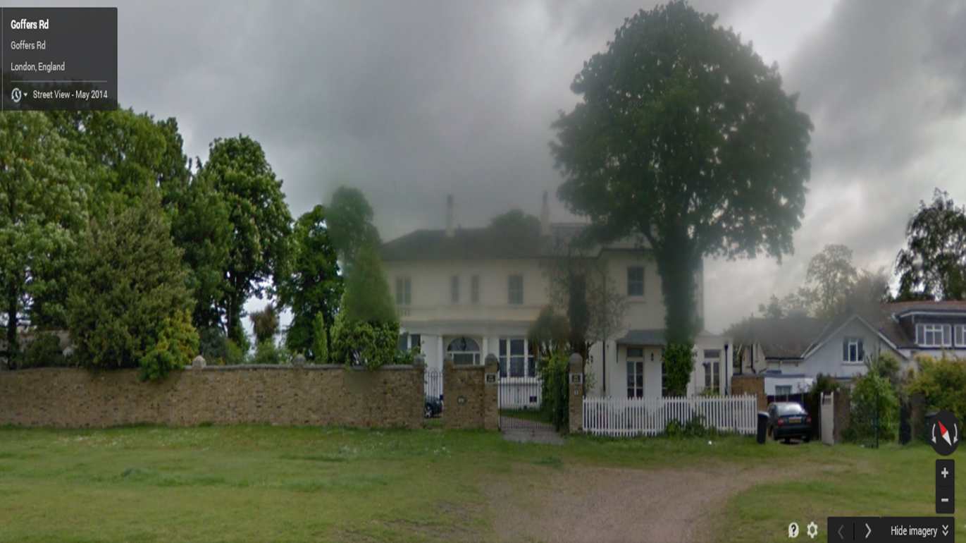
Why: typical teenage girl, mid-length blonde hair, average height, blue eyes, can provide costume. Has previous acting experience. Lives in the house where we are filming.


Boy (Friend)
Name: Gaurav
Age: 17
Why: Average teenage boy, dark hair, slim build, part of the media group already, confident.
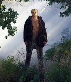

Killer
Name: Edgar
Age: 17
Why: Tall - good for killer as this will look more intimidating, doesn't have to speak, has a taller build so more intimidating and appropriate for the killer.

Girl (Friend)
Name: Rebecca
Age: 17
Why: Average teenage girl, average height, brown hair, blue eyes, part of the media group. Has previous acting experience. Very confident. Slim build.

Girl (Friend)
Name: Holly
Age: 18
Why: Stereotypical teenage girl, average height, purple-blonde hair, has acting experience, part of the media group. Confident in front of camera. Slim build.

Costume Ideas

Final Girl costume
  • Sidney (Scream)
  • She wears simple t-shirts and jeans, still looks very pretty, just not as 'done up' as her female counterpart. 
  • She wears basic/minimal makeup 
  • Our character could wear her hair down and curly, so it looks natural. 
  • Our actor could wear jeans and a t-shirt, maybe a baggy jumper, nothing provocative but also nothing that makes her look like she's from the 1800's.
  • She can wear basic makeup, no lipstick or harsh eye makeup, to look as natural as possible.
  • E.g.: 

Blonde Girl costume
  • Usually more provocative, perhaps shorts and a top, or something more low-cut
  • Blonde hair usually seen
  • E.g. blonde actress from Cabin In The Woods
  • Perhaps more makeup, not over the top though, only a pink shade (not red!)
  • Our actress can wear leggings and a crop top, to show of some midriff and skin
  • Nose piercing (our actress has one)
  • E.g.: 


The Boys
  • In TCITW all male actors wear a top, with an open checked or plain shirt over the top
  • This is quite American though, and we feel that it would be more appropriate to just wear a t-shirt instead, and it is more appropriate for our age group
  • Our actors can wear jeans and a plainish t-shirt
  • Perhaps more sports wear, e.g. trainers to make it more casual.
  • E.g.:


The Girls
  • 'Normal' clothing, e.g. jumpers, t-shirts, jeans, earrings, straight or curly hair, don't make them stand out but don't make them look too plain either.
  • e.g. these girls from 'Jennifer's Body'
  • Our actors could wear their own clothes that they'd wear on a casual day out e.g. skinny blue or black jeans, a t-shirt and jacket, boots or trainers.
  • e.g. 


The Killer

  • All black, usually, gloves often worn
  • Heavy boots, jacket and trousers
  • Sometimes suits are worn e.g. The Strangers
  • Mask - sack mask as seen in other blog posts
  • e.g. Michael Myers / Jason / The Strangers