Thursday 29 January 2015

Poster Deconstruction

You're Next
  • Tagline 'they will hunt you' - relates to the animal theme. use of 'will' highlights certainty - makes audience feel scared 
  • 4 star rating and comment, gives audience idea of how good the film is
  • 'August 29' - information important for audience
  • 3 dimly light figures, masks highlighted the most. weapons also seen - gives audience an insight into the killers
  • slight backlighting / under lighting to cast shadows on the masks, distorts them
  • main colouring is dark with yellow hints, from the lights
  • usual writing at bottom

Friday the 13th
  • 'Welcome to crystal lake' - tag line - relates to the narrative, many people will be familiar with it, due to the original film 
  • Main colours are black and blue, from the sky and the lake. Gives off an eerie connotations 
  • The figure itself is backlighted by the moon's light. This casts shadows and slighlt disfigures the mask - although we can still tell its Jason, as the infamous mask is lit up. The weapon is also visible.
  • Easily identifiable red typography
  • usual writing at bottom 
  • Focuses on the killer and sets it in the woods, giving the audience an idea of the narrative.


A Nightmare on Elm Street
  • In this poster, Freddy takes up the whole space, his burned face visible and his knife fingers visible - there is even a gleam of light to draw attention to it.
  • His infamous striped top and hat are also easily identifiable in this poster
  • They use the tag line 'Never sleep again' from the fairytale like song in the film - fits in with the narrative

The Texas Chainsaw Massacre
  • This poster is slightly more artistic, The title is at the top and an image is used within the text from the film, to give the audience an idea of the narrative
  • The main image is of the state of Texas, with blood dripping out of it, which could be easily done on photoshop. In the image, a famous picture of Leatherface wielding a chainsaw can be seen. This is identifiable to fans of the film
  • 'Who will survive and what will be left of them' - slightly humorous tag line, implying people will be sliced up 
  • usual writing at the bottom

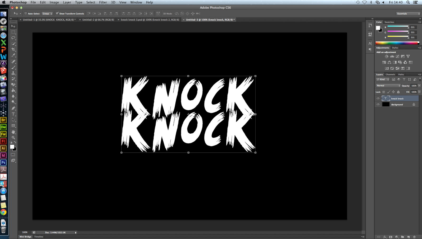
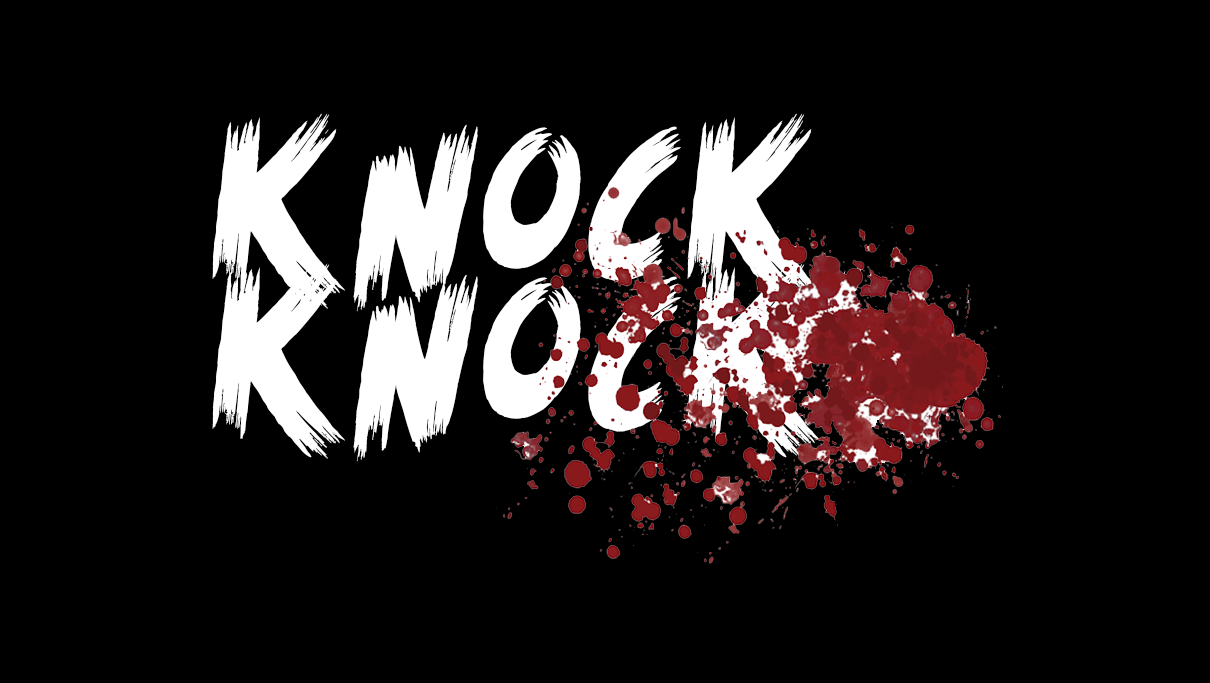
For our poster, we want to get an image similar to the first, of the door with the killer behind it/perhaps looking through the window, and a victim in front, holding the door back? Looking scared? title at the bottom, tag line at the top, usual writings at the bottom, possibly a rating on the poster somewhere


Tuesday 27 January 2015

First Draft + Feedback + To-Do

Our first draft: 

Feedback
  • remove all unimportant scenes that reduce the quality e.g. stairs, hiding by the door
  • remove unnecessary lengthy sequences e.g. coming back in after shutting door, unnecessarily long party scenes. 
  • sort out the sound so it is in time with the cuts
  • switch around some parts of the sequence to make it more effective
  • re-film the things below

To-Do
  • film close ups of eyes looking scared, bruised
  • pitch black, heavy breathing, lighting match, masked face appearing behind
  • running through door, slamming it shut
  • quick flashes of dead victims - only a second, could use photographs 
  • take pictures for the poster

Editing Titles

For our titles, we wanted to use a font that appeared to be scratched into wood, as if it were scratched into the door, as our whole film has the theme of 'knock knock' and the door. To do this, we decided on the font 'Scream again' which we downloaded from dafont.com

We had a sequence of the killer slowly turning his head to the camera, and we thought we could use this with the title, to create an eerie clear reveal of the killers mask in full.

We also decided to manipulate the font, in order to give the titles an interesting twist. We used the effect 'bad tv', and turned the 'amount' up to full, to make the words 'roll' and stutter, for only a split second. The typography interrupted the images, to distort his face.

In this image, the distortion of the text can be clearly seen, as it rolls up the screen as if there was some kind of technological glitch.


We also used this for our typography throughout our opening. The 3 purple clips seen show the different effects. The first is the plain text 'WHO'S THERE?', the second it is moved slightly with the effect 'Bad tv', and the third 'flashing' to give it a burn out kind of effect, as if an old style projector was burning out:

Photoshop Practise - Text manipulation


I decided that I wanted to practise some photoshop skills before we made our poster, so that it could be as best as possible. I thought a good place to start would be by manipulating the titles to make them more effective. I started with the simple 'KNOCK KNOCK' font 'scream again' from dafont.com, on a black background.
One effect I've seen which is quite effective is using blood splatters in the text. I found this one on google by typing in 'blood splatter' and saved it to my desktop. I then dragged it onto the image. It had a white background on it so I had to find out how to remove the background.


Using the eraser tool > magic eraser tool, I removed the background of the blood splatter and positioned it where I wanted.


Then I needed to back the blood splatter blend into the text, so I found out how to do this. I used the panel on the right hand side and selected 'darken' to make the blood fit inside the text, to make it look cleaner and more professional. 

After this, I added another blood splatter effect that looks more like a smear, to add some more dimension. I also added another copy of the text but moved it slightly and made it a crimson red colour, to look like a shadow, and make the text more '3d'. 


This is the finished product. If i re-did this, I'd try and make the letters move a bit more out of a straight line, but I could not work out how to do it at the time. I think that this could be used on our poster, but with different colours, depending on the background. 

For this, I took initial inspiration from this YouTube video, which didn't actually explain how they did it: